Home
Home  Navigation


Civilization VII's Deluxe Edition launched just yesterday, and the internet is already buzzing about its UI and other issues. But is the UI truly that bad? Let's delve into the game's interface elements and assess whether the online criticism is justified.
← Return to Sid Meier's Civilization VII main article
Is Civ 7's UI as Bad as They Say?
Early adopters of the Deluxe and Founder's Editions have had less than a day with Civ VII, yet it's already facing significant criticism, especially regarding its user interface (alongside missing quality-of-life features). While it's tempting to join the chorus of complaints, let's objectively analyze whether the UI truly deserves the harsh judgment. The best approach? A piece-by-piece examination to determine if it meets the standards of a good, or at least functional, 4X interface.
What Makes a Good 4X UI?
Defining an objectively "good" 4X UI is tricky. A game's context, style, and goals influence UI design, making universal rules difficult to apply. However, visual design principles reveal common elements found in successful 4X interfaces. Let's use these principles to evaluate Civ VII's UI.
Clear Information Hierarchy
A clear information hierarchy prioritizes accessibility and importance. Essential resources and mechanics should be prominent, while less critical features remain easily accessible. A good UI doesn't display everything at once; it organizes information logically.
Against the Storm provides a strong example. Building info menus, accessed via right-click, use tabs to organize information by relevance and frequency of use. Common actions are prioritized, while less frequent functions are tucked into separate tabs.
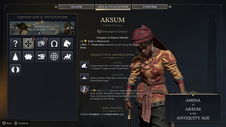
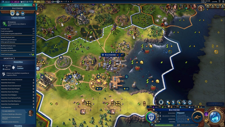
Let's analyze Civilization VII's resource summary UI. It displays resource allocation, neatly separating income, yields, and expenses via dropdowns. The table format is efficient, and the menu collapses easily.
However, it lacks specificity. While showing resource origins in Rural Districts, it doesn't pinpoint the exact district or hex. Expense breakdowns are also limited. It functions, but greater granularity would improve it.
Effective and Efficient Visual Indicators
Effective visual indicators use icons and graphics to convey information quickly, minimizing reliance on text. Symbols, colors, and overlays should communicate data efficiently.
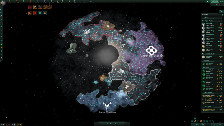
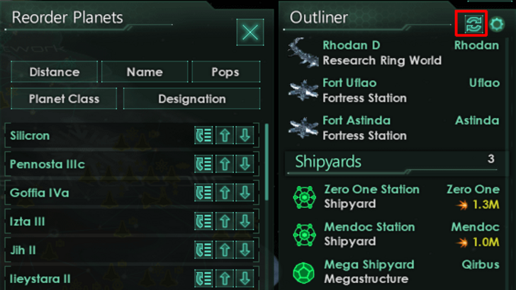
Stellaris, despite its cluttered UI, showcases effective visual indicators in its Outliner. At a glance, players understand ship status (transit, orbit, scanning). Icons on planets and habitats indicate needs, reducing clicks.
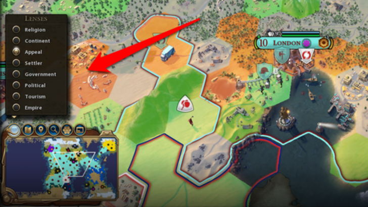
Civ VII uses iconography and numerical data for resources, but some effective visual indicators exist. The tile yield overlay shows resource availability, the settlement overlay color-codes hexes for city viability, and the settlement expansion screen distinguishes tile types.
The main complaint is the absence of certain Civ VI lenses (appeal, tourism, loyalty). The lack of customizable map pins is also criticized. While not terrible, Civ VII's visual indicators have room for improvement.
Searching, Filtering, and Sorting Options
In complex 4X games, search, filter, and sort options are crucial for managing information overload. Search bars, filters, and sort buttons streamline navigation.
Civ VI's powerful search function is a prime example. Players can search for resources, yields, units, or features, with the game highlighting locations. The Civilopedia links entries to map elements.
Civ VII lacks this search function, a significant drawback for many players. This absence severely impacts usability, especially considering the game's scale. Adding this feature, along with enhanced Civilopedia functionality, is essential.
Design and Visual Consistency
The UI's aesthetic and cohesiveness significantly impact the player experience. A poorly designed UI detracts from gameplay, regardless of its quality.
Civ VI's dynamic, cartographical style is a strong point, blending seamlessly with the game's aesthetic. It enhances the overall experience.
Civ VII adopts a minimalist, sleek design, prioritizing sophistication over vibrant visuals. The restrained color palette aligns with the game's aesthetic, but it's less visually striking, leading to mixed reactions. Visual design is subjective, but the lack of immediate clarity is a valid concern.
So What’s the Verdict?
Not the Best, But Undeserving of Excessive Criticism
Civ VII's UI, while not perfect, doesn't deserve the intense criticism it's received. It lacks key features, especially a search function, but this isn't game-breaking. Compared to other issues, the UI shortcomings are minor. While it's less visually striking than other 4X UIs, it possesses strengths. With updates and player feedback, it can improve significantly. Currently, it's not as bad as many claim.
← Return to Sid Meier's Civilization VII main article
Sid Meier's Civilization VII Similar Games

 Latest Articles


 Latest Games